Colour plays a quiet but important role in how people notice and understand a brand. Long before someone reads your name or learns what you offer, the colours you choose create a feeling. Research shows that colour can strongly support brand recognition, and this makes it an essential part of how a business presents itself.
In a place like Dubai, where customers come from many backgrounds and expectations vary, having a clear and thoughtful colour palette helps people understand your brand more easily. It gives them a sense of what you stand for and what kind of experience they can expect when they interact with you.
A brand built around calm, steady colours can feel reassuring. A brand with brighter tones can feel more upbeat or welcoming. These reactions happen naturally, which is why choosing colours with intention can make communication simpler and more consistent.
This article explores how to select colours that fit your brand’s personality, your audience, and the nature of your business. The goal is to help you make choices that feel clear, natural, and aligned with what your brand wants to express.
“Color is a fundamental element in branding and marketing that influences consumer perception, behavior, and emotional response.” — ResearchGate
Before You Choose Colours, Get Your Brand Basics Clear
Choosing colours becomes much easier when you have a clear understanding of what your brand stands for. Colour is not meant to decorate your brand; it is meant to support it. This is why many branding experts recommend starting with the foundation before selecting any visual elements.
Begin with the essentials:
- What do you sell?
A service, a product, or an experience — each one carries different expectations. - Who is your audience?
In Dubai, this can include local Emiratis, long-term expats, tourists, and B2B clients. Different groups respond to colours in different ways, which is supported by research in cross-cultural branding and consumer psychology. - How is your brand positioned?
Affordable, mid-range, premium, or ultra-luxury — colour plays a quiet role in signaling this. Studies in marketing communication show that premium brands often rely on more restrained palettes, while approachable brands may use brighter tones to appear friendly and open.
Once these basics are clear, define your brand personality in three to five words. These words describe the feeling your brand wants to express — for example, warm, trustworthy, modern or bold, youthful, fun. According to branding research published in the Journal of Marketing Communications, colours work best when they align with a brand’s intended personality and the emotional message behind it. This means your personality words can guide you toward families of colours that naturally express those qualities.
When the foundation is set, colour selection stops being a random choice and becomes part of a thoughtful, strategic identity. It helps your brand communicate clearly and consistently, especially in a diverse market like Dubai, where audiences come with different expectations and cultural associations.
Colour Psychology: Simple Meanings to Guide Your Choices
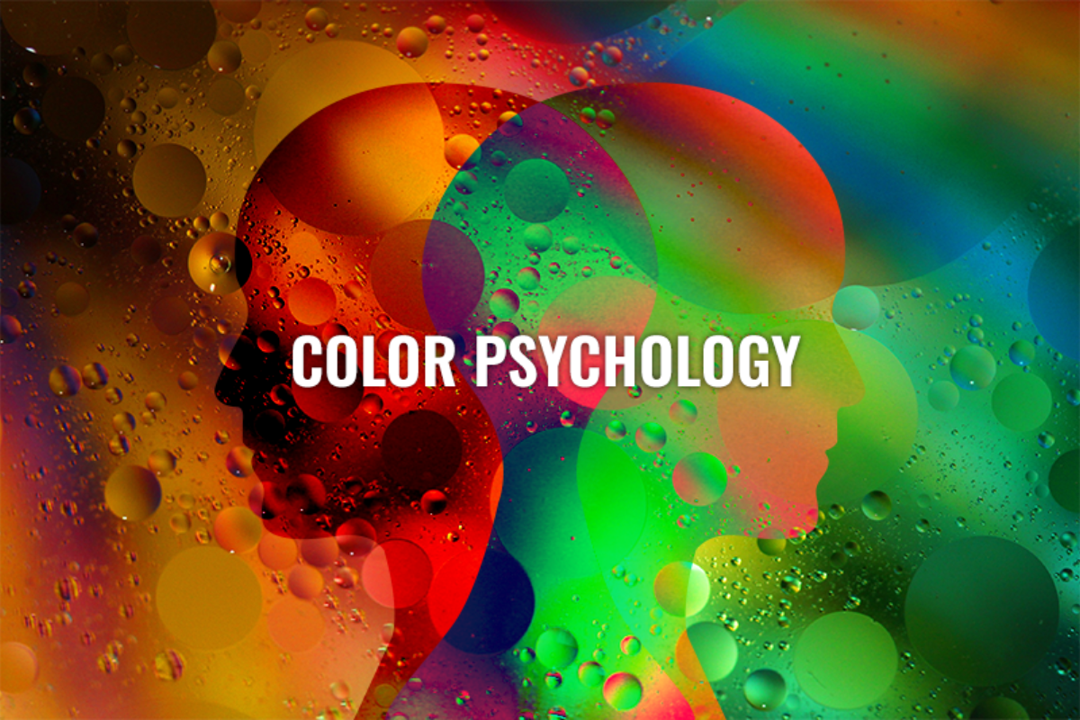
Colour psychology can be useful when choosing a brand palette, as long as it is approached with clarity. Colours do carry common associations, but they do not have a universal meaning. Their impact often depends on the product category, the audience, and the cultural background of the people viewing them — something highlighted in studies from the Journal of Marketing & Social Research and other consumer-behaviour publications. With that in mind, the following meanings are general guides, not strict rules.
Here is a simple look at how some main colours are commonly used in branding:
| Colour | General Association | Common Use in Branding |
|---|---|---|
| Blue | Trust, calmness, reliability | Banks, healthcare, technology |
| Red | Energy, urgency, passion | Food, retail, entertainment |
| Green | Growth, balance, sustainability | Wellness, environmental brands, finance |
| Yellow | Optimism, clarity, friendliness | Hospitality, kids’ brands, lifestyle products |
| Orange | Creativity, warmth, enthusiasm | Media, e-commerce, education |
| Purple | Quality, imagination, differentiation | Luxury, beauty, innovation |
| Black | Strength, sophistication, simplicity | Premium and minimalistic brands |
| White | Clarity, purity, openness | Healthcare, luxury, lifestyle |
| Brown / Earth tones | Stability, comfort, groundedness | Cafés, organic brands, heritage-focused products |
These associations appear frequently in branding guides and design resources such as Circleout and other UAE-based creative agencies. They offer a starting point for understanding how colour influences perception, but real decisions should always link back to your brand personality and audience.
It is also helpful to remember that the combination of colours can influence how each shade is perceived. A bright colour paired with neutrals can feel modern and balanced, while the same colour used alone may feel overwhelming. Research in brand identity design notes that palettes work best when primary and secondary colours support one another and create a clear visual hierarchy.
Overall, colour psychology can guide your decision-making, but its meaning becomes strongest when used thoughtfully — in the right context, for the right audience, and in harmony with the rest of your brand identity.
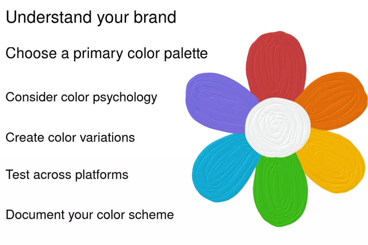
A Simple 5-Step Process to Choose Your Brand Colour Palette
Choosing your colours becomes easier when you follow a structured method. These five steps bring clarity to the process and help ensure that your palette supports your brand rather than distracting from it.
1. Audit Your Industry and Competitors
Start by observing what already exists in your space. Look at five to ten brands — both within Dubai and globally — and note the colours they use. This gives you a sense of what customers naturally expect in your category.
Once you see the patterns, ask a simple question:
Should your brand follow the familiar colours of the category for clarity, or should it intentionally stand out? There is no single correct answer — just the choice that supports your strategy.
2. Match Colours to Your Brand Personality
Return to the three to five personality words you defined earlier. These words act as the filter for choosing the right family of colours. Branding firms, including Ascend Spark Agency, often use this method because it keeps the decision aligned with the emotional tone the brand wants to express.
A few simple examples:
- Trustworthy, calm, professional → shades of blue or muted neutrals
- Energetic, creative, lively → warm tones like orange or yellow
- Refined, premium, minimal → black, white, or muted metallics
Use the colour psychology guides as a reference, not a rulebook. The goal is to find a natural fit between your personality and your palette.
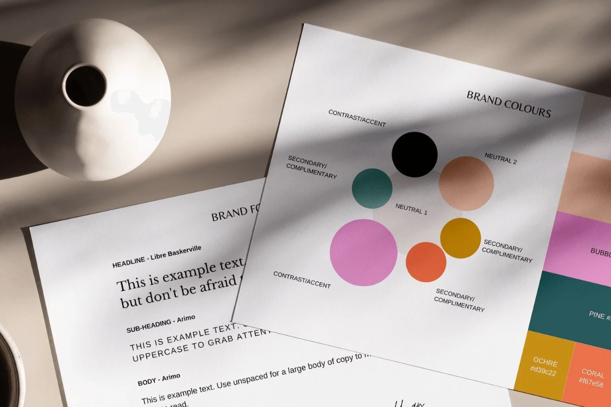
3. Build a Clear Palette: Primary, Secondary, and Accent
A clean palette usually has three parts:
- Primary colour — the main colour people associate with your brand
- Secondary colour — complements the primary and adds support
- Accent colour — used sparingly for emphasis
Many design systems, including Squarespace’s guidelines, recommend the 60–30–10 rule:
- 60% primary
- 30% secondary
- 10% accent
This creates balance and makes the palette easy to use across touchpoints like websites, logos, packaging, and social media. It also helps avoid the confusion that comes from using too many colours at once.
4. Check Practicality: Visibility, Accessibility & Bilingual Use
Colours must look good, but they also need to work well in real environments. Practicality matters more than it seems.
- Check contrast: Text and buttons should be readable, especially on mobile screens. The UAE Government Design System highlights the importance of accessible colour contrast for digital communication.
- Test in both Arabic and English: Some colours work better with certain scripts or weights of typography. Ensuring harmony in both languages keeps your brand consistent.
- Ensure consistency across formats: Digital screens, print materials, packaging, and signage can display colours differently. Testing helps avoid mismatches.
Small considerations like these improve user experience and maintain a professional, reliable feel.
5. Test With Real People Before Finalising
Testing your colours with people can be simple and effective. Share two or three colour options with a small group of customers, colleagues, or community members and ask them which one feels clearer, friendlier, or more aligned with the type of business you run. Keep the visuals minimal — a logo or a mockup is enough — so their feedback focuses on the colour, not the design.
You can also do quick in-person tests by showing the palette briefly and asking what first impression comes to mind. If you already have regular customers, asking them during casual interactions often gives the most honest responses. These conversations help you understand how your colours are interpreted by real people, not just how they look on a screen.
Common Mistakes to Avoid

A strong colour palette can support your brand, but a few common missteps can weaken it. Being aware of these helps you make more confident and informed decisions.
1. Choosing colours based only on personal preference
Many founders pick colours they personally like, but platforms such as Pixpa note that this often leads to a mismatch between the brand’s identity and what the audience actually expects. Colour decisions should be linked to strategy, not taste.
2. Using too many colours and creating visual clutter
Unlimited graphic design resources frequently highlight that large or inconsistent palettes make brands look messy. A focused set of two to three core colours helps the overall identity feel cleaner and more intentional.
3. Copying competitors too closely
Looking at your industry is useful, but copying another brand’s palette can cause your identity to blend in. Marketing agencies like MARION caution that brands lose memorability when they rely too heavily on what others are doing instead of building their own distinct visual voice.
4. Ignoring how colours behave in Arabic and English layouts
The UAE Design System reminds businesses that colours interact differently depending on typography and script direction. Some colours may look balanced in English but overpowering or less readable in Arabic. Testing both ensures consistency.
5. Overlooking accessibility and contrast requirements
Readable text is essential, especially in a digital-first market. Poor contrast between text and background reduces clarity on mobile screens and across different lighting conditions. The UAE Design System provides specific contrast recommendations that support inclusivity and better user experience.
6. Not testing colours on real devices and real materials
Colours can appear different on screens, in print, on packaging, or in outdoor signage. Skipping this step often leads to inconsistencies that dilute the brand’s look and feel.
7. Choosing trendy colours instead of timeless ones
Trends come and go quickly. A palette chosen only because it’s “in style” may not support long-term brand consistency. A steady, research-backed palette performs better over time.
8. Forgetting future use cases
If colours are picked without considering future website updates, product packaging, uniforms, or signage, the brand may struggle with expansion later. Thinking ahead helps maintain a cohesive look as the business grows.
Choosing the right colours is less about finding the “perfect” shade and more about creating a clear and steady foundation for how your brand presents itself. When your palette reflects your personality, aligns with your audience, and works well across everyday touchpoints, it becomes easier for people to recognise and understand your business. A thoughtful approach helps your brand stay consistent as it grows and communicates more simply in a busy market like Dubai. With a bit of clarity and intention, your colours can quietly support the message you want your customers to feel every time they come across your brand.
Also read: