Dubai is a city where brands live everywhere, on skyscrapers along Sheikh Zayed Road, in hyper‑designed malls, in packed community souqs, and on the phones of a hyper‑connected population. Customers here are exposed to polished identities from global giants like Emirates, Emaar, and Dubai Tourism alongside agile local brands competing for the same attention. In this environment, inconsistent visuals or mixed messaging make a business look small, unreliable, or forgettable.
A brand style guide is your antidote to that chaos. It is a simple, practical document that explains how your brand should look and sound across every touchpoint: logo, colors, fonts, imagery, and tone of voice. For Dubai SMEs that work with freelancers, agencies, and multicultural teams, a style guide becomes the “single source of truth” that keeps everything aligned as you grow.
This article walks through how to create a brand style guide tailored for brands in Dubai—from defining your brand foundations to documenting visuals, voice, and real‑world examples your designers and teams can follow.
Step 1: Clarify Your Brand Foundations
Before deciding on colors or fonts, you need clarity on who you are as a brand and who you serve. This foundational section is usually one or two pages in the style guide.
Define your brand core
Include:
- Mission: Why your brand exists in one or two sentences (for example: “To make gourmet, locally roasted coffee accessible to busy professionals in Dubai Marina”).
- Vision: Where you want to be in 3–5 years.
- Values: 3–5 core principles that guide how you operate (e.g., Innovation, Hospitality, Reliability, Transparency).
- Brand personality: Choose 3–4 adjectives that describe how your brand should feel (e.g., Bold, Warm, Modern, Premium).
Anchor it in Dubai
Because this guide is for a Dubai brand, explicitly reference:
- Your primary locations or communities (e.g., JLT, Al Quoz, Sharjah/Dubai commuters).
- Your mix of audiences (Emirati, Arab expat, South Asian, Western expat, tourists).
- How you want to balance global appeal with local cultural relevance (e.g., blending modern minimalism with subtle Arabic patterns or calligraphy).
This section gives context so that every later decision—like choosing a modern geometric typeface or a warm desert‑inspired palette—ties back to strategy, not personal taste.
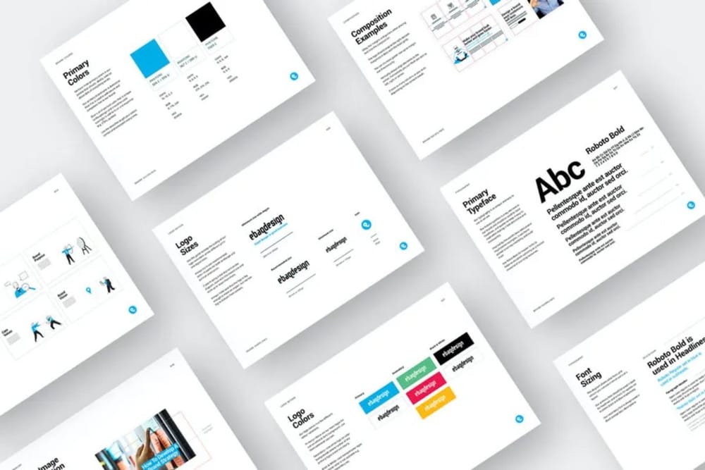
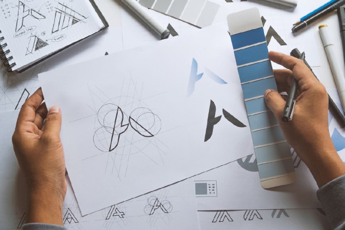
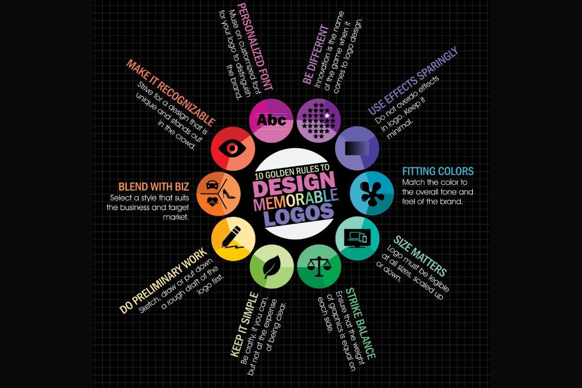
Step 2: Document Your Logo and Its Rules
cThe logo section is one of the most referenced parts of a style guide. The goal is to ensure your logo always appears clearly and consistently, whether on a signboard in Karama or an Instagram profile.
Show logo variations
Include:
- Primary logo: The main version used in most cases.
- Secondary logo: Horizontal or stacked versions for tight spaces.
- Icon or mark: A simplified symbol or monogram for app icons, favicons, and social media avatars.
Under each, show examples on light and dark backgrounds.
Set usage rules
Define:
- Clear space: Minimum space around the logo (e.g., “Maintain a margin equal to the height of the letter D around the logo”).
- Minimum size: The smallest size it can appear without losing legibility.
- Backgrounds: Approved background colors and textures.
Add a “Do & Don’t” page with visual examples:
- Do: Keep proportions, use approved colors, place on clean backgrounds.
- Don’t: Stretch or squash, add drop shadows, change colors, put on busy photos.
For Dubai brands, you might also include a note on bilingual (Arabic–English) logo lockups if you use both languages together.
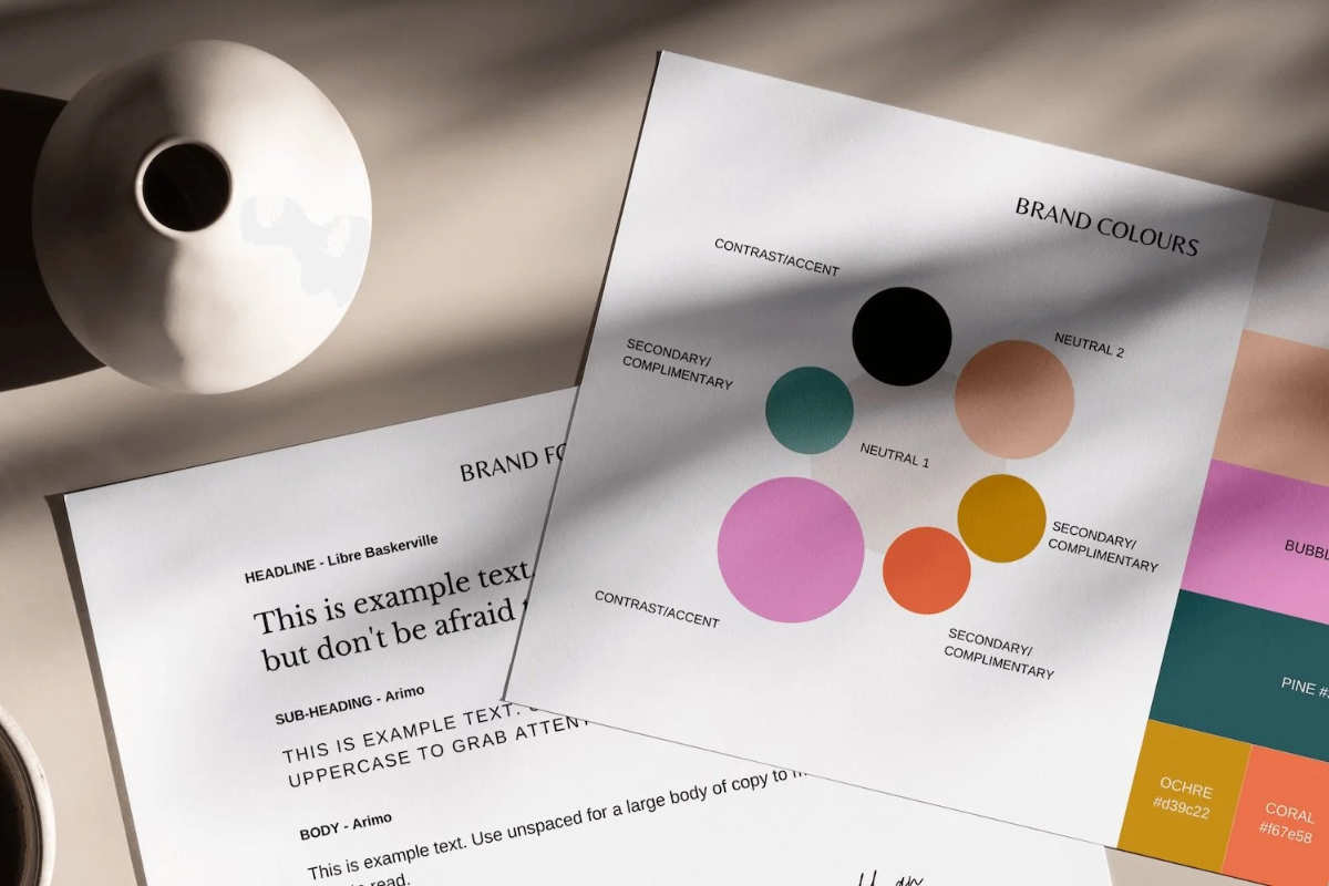
Step 3: Define a Color Palette That Fits Dubai
Color is where Dubai brands can really stand out. You want something that feels true to your audience and category, while also working across digital and physical environments in intense sunlight and illuminated mall interiors.
Build your palette
Most effective palettes have:
- Primary colors (1–2): Your main brand colors (for example, a deep teal and a sand beige).
- Secondary colors (2–3): Supporting colors for backgrounds, highlights, and infographics.
- Neutrals (2–3): Whites, off‑whites, greys, and black for text and balance.
For each color, list technical values:
- HEX
- RGB
- CMYK
- (Optional) Pantone for print signage and packaging
Reflect local context
Consider:
- Warm tones inspired by desert landscapes, architecture, and the sea.
- Use of gold or metallic accents for premium Dubai positioning.
- How your palette will look on outdoor signage under strong sun and at night under LEDs.
Set usage rules
Add simple guidelines such as:
- “Use primary teal for 60% of brand surfaces, secondary sand for 30%, and accent coral for 10% of highlights and call‑to‑action buttons.”
- “Avoid using more than three brand colors in one graphic, apart from neutral shades.”
This keeps your brand recognizable and avoids visual clutter.
Step 4: Choose Typography (Fonts) and Hierarchy
Typography affects how professional and readable your brand feels in Arabic and English.
Select your typefaces
Usually:
- Primary typeface: For headings (e.g., a modern sans‑serif).
- Secondary typeface: For body text (could be the same family in lighter weights, or a complementary font).
- Arabic pairing: If you communicate in both languages, choose an Arabic font that matches the tone of your Latin typeface in weight and personality.
Document:
- Font names, weights (Light, Regular, Bold), and where to download or purchase them.
- Usage examples: H1, H2, body copy, captions.
Define hierarchy and styles
Show examples such as:
- H1: 36 px / Bold / Brand color
- H2: 28 px / Semi‑Bold / Dark neutral
- Body: 16 px / Regular / Dark grey
- Buttons: 16 px / All caps / Bold / Accent color
For Dubai’s mobile‑first audiences, emphasize legibility on small screens. Encourage sufficient line spacing and contrast to work well in both Arabic and English.
Step 5: Set Guidelines for Imagery and Icons
This section ensures your photos, illustrations, and icons all feel like they belong to the same brand story.
Photography style
Specify:
- Subjects: People, products, spaces, cityscapes, or a mix.
- Tone: Bright and energetic vs. calm and minimal; candid vs. posed.
- Color treatment: Natural colors, warm filters, or slightly desaturated tones.
For Dubai brands, you might highlight:
- Including diverse faces that reflect the city’s multicultural population.
- Showing real local environments—malls, cafés, desert, metro, waterfronts—when relevant.
- Avoiding generic stock imagery that could belong to any country.
Illustrations and icons
If your brand uses icons or illustrations:
- Show your icon set (line weight, filled vs outline, rounded vs sharp).
- Explain any recurring shapes or motifs (e.g., geometric patterns inspired by mashrabiya).
- State color rules (e.g., “Icons use primary teal lines with neutral fills”).
Use “good vs. bad” examples so freelancers quickly understand what fits and what doesn’t.
Step 6: Define Your Brand Voice and Tone
A Dubai brand style guide shouldn’t stop at visuals. The way your brand “sounds” in writing is just as important, particularly in a bilingual and multicultural market.
Voice: Who you are
Capture your voice in 3–5 traits, for example:
- Confident but not arrogant
- Friendly and helpful
- Straightforward and jargon‑free
- Inspirational but practical
Explain what each means in practice.
Tone: How you adjust
Describe how tone shifts slightly by channel:
- Website: Clear, reassuring, structured.
- Instagram: Conversational, a little playful, more emoji‑friendly.
- LinkedIn: Professional, insight‑driven, still human.
- WhatsApp messages: Short, polite, to the point.
Writing rules
Include:
- Preferred spellings (UAE/British vs US English).
- Rules on emojis, slang, and Arabic phrases (e.g., when it’s appropriate to say “Insha’Allah” or “Shukran”).
- Examples of on‑brand vs off‑brand copy.
For example:
- On‑brand: “We’ll deliver your order across Dubai within 90 minutes—track it live in your app.”
- Off‑brand: “We apologise for any inconvenience caused by potential delays in delivery.”
This helps social media managers, customer service teams, and agencies stay consistent.
Step 7: Lay Out Real‑World Applications
This is where you show how everything comes together. It also makes the guide much easier to understand and apply.
Include mockups for key touchpoints
For a Dubai brand, that might be:
- Website homepage and product page layouts.
- Instagram grid and Stories templates.
- Outdoor signage (shopfront on a busy street or inside a mall).
- Business cards, letterheads, email signatures.
- Packaging, delivery bags, or boxes if you’re in F&B or e‑commerce.
- Presentation slides for corporate or B2B brands (common in DIFC, Dubai Internet City, etc.).
Each mockup should demonstrate:
- Correct logo placement and sizing.
- Use of colors and fonts according to your rules.
- Imagery style and text tone.
You don’t need to design every possible asset—just enough examples that a designer can extrapolate.
Step 8: Decide the Format and How You’ll Share It
A style guide is only useful if people can access and understand it.
Choose a format
Common options:
- PDF document (10–30 pages): Easy to email and print; good for most SMEs.
- Online guideline (Notion, a simple webpage, or a design system tool): Easier to update and share with agencies.
- Design platform file (Figma/Canva): Visual and interactive, useful if your team already works there.
For a Dubai SME, a PDF plus a simple shared online version is usually enough.
Make it easy to use
- Start with a one‑page summary (logo, colors, fonts, tone).
- Use clear headings and lots of visual examples.
- Add a “contact” section: who to ask if someone is unsure (e.g., marketing manager or founder).
Step 9: Keep It Alive and Up to Date
A brand style guide is a living document, not a one‑off project.
Review regularly
- Revisit once a year or after any major change (rebrand, new product line, expansion into new markets).
- Update examples with your best recent work.
- Add new modules as you grow (e.g., motion guidelines for Reels and TikTok, 3D assets, AR filters).
Train your team
- Walk new hires through the guide during onboarding.
- Share it with agencies and freelancers at the start of any project.
- Encourage staff to flag inconsistencies and suggest improvements—especially those who deal with customers daily.
For Dubai businesses that grow quickly or across multiple locations, this discipline prevents “brand drift” as different branches or partners start doing their own thing.
Common Mistakes Dubai Brands Make (and How to Avoid Them)
- Skipping the foundation. Jumping straight into colors and logos without defining mission, audience, and personality leads to pretty visuals that don’t convert.
- Using too many colors and fonts. This dilutes recognition and makes your brand feel cheap or chaotic.
- Ignoring Arabic. If your audience includes Arabic speakers (which, in Dubai, it almost always does), your type choices and logo lockups must consider both scripts.
- Over‑reliance on generic stock. Photos that clearly aren’t from the UAE or show no local context weaken your brand’s connection to Dubai.
- Letting the guide gather dust. Creating a style guide and then not sharing or enforcing it defeats the purpose.
In a city where customers are bombarded with polished brands from all over the world, a coherent and consistent identity is one of the simplest ways a Dubai business can look bigger, more credible, and more memorable than its size. A brand style guide doesn’t need to be complicated or expensive. Even a lean 10–15 page document that clearly explains your logo, colors, fonts, imagery, and voice can transform how your brand shows up—online, in malls, on Sheikh Zayed Road, and in your customers’ hands.
Start with the basics, involve your team, and treat the guide as a living tool that grows with your business. Done well, it will save you time, reduce rework, align your partners, and help your brand earn and keep the trust of Dubai’s fast‑moving, visually savvy audience.
Also Read: