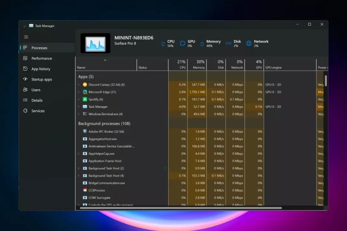
Another visual change is coming to Windows 11 in the form of a refreshed Task Manager. The utility is being updated with a Fluent Design to bring it more in line with the rest of the operating system's modern interface.

The updated version of Task Manager was discovered in Windows build 22538 that was rolled out yesterday. The latest build doesn’t contain a lot of notable changes, but Gustave Monce, the same engineering student who managed to get Windows 11 running on a phone, discovered the hidden feature.
The new-look Task Manager isn’t a complete change from the current tool. Microsoft's mica blur effect, which incorporates theme and desktop wallpaper into the background of windows such as apps and settings, is evident. There are also the rounded corners Windows 11 users will be familiar with.
But there is one notable difference between the two Task Manager versions: the Windows 11 incarnation has removed the previous tabbed interface and replaced it with a sidebar. There are also buttons for creating a new task, ending a task, and other functions.
As this is a hidden feature still in development that Microsoft hasn’t announced yet, much of the new Task Manager isn’t working right now; many of the older version’s elements have been pasted into the new one, though it does appear to have a dark mode.
An earlier Insider Preview Build (22533) brought with it new hardware indicators for brightness, volume, airplane mode, and camera. Windows 11 is also getting a new Notepad and Media player. But for those traditionalists who prefer the way things are, check out our guide on how to make Windows 11 look and feel more like Windows 10.
News Source: Techspot


