Colour is the first thing people notice about a brand—and often the last thing they forget. Long before anyone reads your name, tagline, or offer, their brain has already formed an impression based on your colours: “Is this premium or cheap? Serious or playful? Safe or risky?” In a world where customers scroll past content in seconds and walk past dozens of competing shopfronts in a single mall, your colour choices quietly decide whether they pause, trust, and remember—or keep moving.
In branding and marketing, colour psychology is not about rigid rules (“blue always means trust”) but about managing expectations, context, and consistency so that your visuals match what your business promises.
This article provides guidelines for using colour across logos, websites, social media, packaging, and physical spaces, plus common mistakes to avoid so your brand feels intentional, not accidental.
How Colour Influences Perception
Colour affects three crucial aspects of how customers experience a brand:
- Emotion: Colours can trigger associations—calm, urgency, optimism, luxury, or safety.
- Readability and attention: Certain colour contrasts make content easier to read and calls‑to‑action easier to notice.
- Brand recognition: Consistent use of a specific palette makes your brand instantly recognisable (think of Coca‑Cola red or Tiffany blue).
It helps to think of colour as part of your brand’s “tone of voice.” Just as you choose words carefully, you should choose colours that match what you want people to feel.
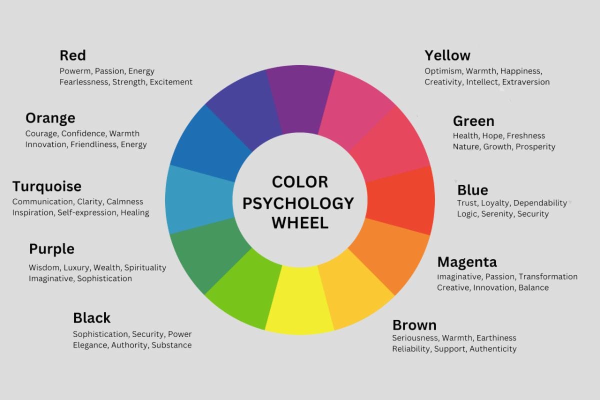
Common Colour Associations (And Their Caveats)
There are common Western associations, but culture, context, and industry matter. It’s safer to treat these as tendencies, not laws.
Red
- Perceptions: Energy, passion, urgency, excitement, sometimes danger.
- Typical uses:
- Food and beverage (to stimulate appetite and energy).
- Promotions, sales tags, clearance banners.
- Risks: Overuse can feel aggressive or stressful, especially in premium or wellness contexts.
Blue
- Perceptions: Trust, reliability, calm, professionalism.
- Typical uses:
- Banks, financial services, healthcare, corporate brands.
- Tech companies wanting to signal dependability.
- Risks: Too much blue can feel cold or distant if not balanced with warmer accents.
Green
- Perceptions: Nature, health, sustainability, growth, money.
- Typical uses:
- Organic, eco‑friendly, or wellness brands.
- Financial services (growth and prosperity).
- Risks: Using green to appear “eco‑friendly” without genuine practices can look like greenwashing.
Yellow and Orange
- Perceptions: Optimism, friendliness, youthfulness, spontaneity.
- Typical uses:
- Brands targeting families, children, or budget‑friendly segments.
- Highlighting deals and calls‑to‑action.
- Risks: Hard on the eyes at large scale or with poor contrast; can feel cheap if used heavily in luxury contexts.
Purple
- Perceptions: Creativity, luxury, spirituality, uniqueness.
- Typical uses:
- Beauty, wellness, creative industries.
- Premium but slightly unconventional brands.
- Risks: Overuse can feel artificial or niche if not grounded with neutrals.
Black, White, and Neutrals
- Black: Sophistication, power, elegance, seriousness.
- White: Simplicity, cleanliness, minimalism, space.
- Gray, beige, taupe: Balance, subtlety, professionalism, understated confidence.
Neutrals are the backbone of many palettes; they support accent colours and make designs feel modern and uncluttered.
Culture, Context, and Audience
Colour meaning is not universal. A few important nuances:
- Cultural differences:
- White can mean purity in some cultures, mourning in others.
- Red may signal luck and celebration in some regions, danger or debt in others.
- Industry context: The same shade can feel different in different industries—red in food vs. red in finance communicates very different things.
- Audience age and segment: Younger audiences often tolerate bolder, high‑contrast palettes; older audiences may prefer calmer, higher‑readability schemes.
For markets like Dubai or other cosmopolitan cities, where customers come from many backgrounds, it’s safer to use broadly positive associations and avoid colours that might be strongly negative in any major cultural group you serve. When in doubt, testing with real customers is more reliable than assumptions.
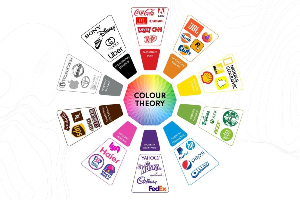
Colour and Brand Positioning
Your colour palette should match your positioning on:
- Price:
- Luxury or premium brands tend to favour deep, rich colours (navy, black, deep green, burgundy) with lots of white space.
- Discount or volume brands often use bright, energetic colours and larger areas of colour to signal accessibility and excitement.
- Personality:
- Playful/fun: brighter hues, rounded shapes, more contrast.
- Serious/professional: muted tones, structured layouts, more neutrals.
- Category norms:
- Leaning into category norms (“blue for finance”) can help new brands be instantly understood.
- Deliberately breaking them (e.g., a playful pink legal brand) can work if you want to be seen as a challenger—if done thoughtfully.
A quick gut‑check: if you removed the logo from your website or packaging, would the colours and style still roughly match what you sell, who you sell to, and how you want to be perceived?
Practical Guidelines for Choosing a Colour Palette
- Start from Strategy, Not “Favourite Colours”
Before picking shades, answer:
- What three adjectives describe your brand (e.g., bold, trustworthy, warm)?
- Who is your primary customer segment?
- Are you premium, mid‑market, or budget?
- Which brands do your customers already know, and how do they “feel” visually?
Translate those answers into colour directions: for example, “premium + calm + trustworthy” suggests blues, deep greens, and neutrals; “youthful + energetic + accessible” suggests brighter oranges, yellows, or turquoise with clean white.
- Use the 60–30–10 Rule
A simple way to build a palette:
- 60% – Dominant colour (often a neutral like white, light beige, or very light gray).
- 30% – Secondary colour (supports your brand personality, used in headers, backgrounds, larger areas).
- 10% – Accent color (for buttons, calls‑to‑action, highlights).
This keeps designs looking balanced instead of chaotic.
- Prioritise Contrast and Accessibility
Colour psychology is meaningless if people can’t read your content.
- Ensure text contrasts strongly with background (dark text on light background, or vice versa).
- Avoid colour combinations that strain the eyes (bright yellow text on white, red text on black).
- Don’t rely on colour alone to convey meaning (add icons or underlines for important information, in case of colour blindness).
- Aim for Consistency Across Touchpoints
For colour to work as a branding tool, it must be consistent:
- Use the same brand colours on your website, social media, packaging, signage, and printed materials.
- Document your palette in a simple style guide (with hex codes/RGB/CMYK) so designers, printers, and staff all use the same tones.
- Avoid changing colours frequently; frequent shifts make it harder for customers to recognise you quickly.
Colour in Action: Applications Across Channels
Logos and Visual Identity
Your logo should be legible in:
- Full colour.
- Black and white.
- On both light and dark backgrounds.
Avoid overly complex gradients or effects that break down when resized; flat or simple colour treatments tend to scale better.
Websites and Apps
- Use your dominant colour for backgrounds or large sections.
- Use accent colours for buttons, links, and important notices.
- Keep ample white space so colours don’t overwhelm.
Think about the emotional journey: calm colours for serious reading sections; bolder accents for calls‑to‑action.
Social Media
Consistency is key:
- Use a limited set of brand colours for post backgrounds, text overlays, and story templates.
- Over time, followers should be able to recognise your posts in their feed just by colour and style, even before seeing your name.
- Seasonal tweaks (e.g., adding gold for festive periods) can work if they complement your core palette.
Physical Spaces and Packaging
For brick‑and‑mortar businesses:
- Exterior signage should contrast strongly with the building and surroundings to be visible from a distance.
- Interior colour choices affect dwell time and comfort (e.g., softer tones in waiting areas, bolder accents in product zones or impulse areas).
- Packaging that reflects your brand colours reinforces memory and recognition on shelves and in unboxing moments.
Testing and Refining Your Colour Choices
Instead of relying solely on theory:
- Run simple A/B tests online:
- Try two versions of the same ad or landing page with different button colours or background hues.
- Track which version gets more clicks, inquiries, or sales.
- Get feedback from real customers:
- Ask how your brand “feels” just by looking at your visuals.
- Check if their words align with your intended positioning (e.g., if they say “fun and cheap” but you meant “professional and premium,” something is off).
- Watch for unintended signals:
- Does your colour palette accidentally resemble a well‑known competitor?
- Does it evoke a category you don’t want to be associated with?
Colour decisions don’t have to be final forever, but changes should be deliberate, not constant.
Common Mistakes to Avoid
- Choosing colours only because you like them personally. Your brand is for your customers, not your own wardrobe.
- Using too many colours. More than 3–4 core brand colours usually looks messy unless managed by a pro.
- Ignoring cultural context. Especially in diverse markets, be aware of strong local meanings.
- Neglecting readability. Light gray text on white, or red on black, might look “stylish” but frustrate users.
- Rebranding colour too often. Frequent colour changes erode recognition and trust.
The psychology of colour in branding and marketing is about understanding how colour shapes emotions and expectations, then making deliberate choices that reinforce your positioning and help customers recognise, remember, and feel comfortable with your brand.
When you treat colour as a strategic asset—grounded in your audience, your market, and your message—it stops being background decoration and starts working as one of the most powerful, cost‑effective tools in your entire brand toolkit.
Also Read: