For over a decade, brand visibility was measured in a single currency: attention. A post earned a like, a share, or a comment, and then it disappeared into the feed within hours. That model still dominates most social platforms, where content is built for a single moment of consumption and rarely retrieved again. Pinterest built something different.
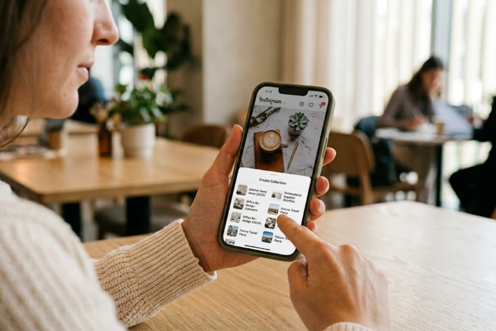
With 537 million monthly active users and more than 1.5 billion Pins saved every week, the platform runs on a behavior most social networks never designed for: deliberate, long-term curation. A user does not save a Pin because it entertained them for three seconds. They save it because they intend to return to it for a renovation, a wardrobe decision, a menu, a brand they are considering hiring.
This shift matters well beyond Pinterest itself. It reflects a broader change in how audiences relate to visual content across every platform, including LinkedIn, Instagram, and corporate websites. Consumers and business decision-makers alike are becoming curators of their own reference libraries, and they are selective about what earns a place in them. A brand's visual identity is no longer judged only on whether it stops the scroll. It is judged on whether it is worth keeping.
This article examines what that shift means for how companies design their visual presence. The central argument is straightforward: brands that want to be remembered need to design content that can be retrieved and used later, well beyond the single moment it first appears on screen. Building a visual identity people want to save requires understanding the psychology of curation, applying disciplined visual architecture, prioritizing utility over novelty, and studying the brands that already do this well. Each element is examined below with verifiable examples.
Deconstructing the "Save" Psychology
A double-tap costs nothing. It requires no judgment about future usefulness, no assessment of whether the content fits a broader plan. A save is different. Pinterest's own research into purchase behavior shows that a large majority of weekly users have made a purchase directly influenced by something they saved, and the platform's purchase-intent signals run several times higher than the social media average.
That gap exists because saving is a planning action, not a reaction. When someone saves a Pin, they are mentally filing it under a future decision: a kitchen they will renovate next year, a supplier they will contact when the budget opens, a service provider they are shortlisting.
This has a direct implication for brand design. Content built to provoke an emotional spike, a bold claim, a dramatic before-and-after, an urgent call to action, performs well for immediate engagement but rarely earns a save. Save-worthy content answers a different question in the viewer's mind: "Will I need this later?" That means the value has to be legible at a glance and independent of the original context. A person scrolling past a saved image weeks later will not remember the caption, the campaign, or the mood they were in when they first saw it. The image itself has to carry the information.
This is also why unbranded search dominates Pinterest. Most of the platform's top searches are generic descriptions of a need or style rather than a company name, because people are searching for solutions before they have chosen who to buy from. A brand's visual assets are competing to become the answer to a need-based search, not to win recognition among people who already know the brand. Recognition value alone is not the differentiator; problem-solving clarity is.
The same principle now applies inside professional environments. A prospective client browsing a services company's portfolio, a procurement officer reviewing supplier decks, or a hiring manager assessing a firm's case studies are all engaged in the same save-oriented behavior as a home Pinterest user, weighing whether an asset is worth referencing again when the actual decision point arrives. Designing for that moment, rather than for the first thirty seconds of attention, is the core discipline this shift demands.
Visual Architecture: Designing Assets That Fit the Modern Aesthetic Grid
Save behavior on Pinterest has trained a global visual vocabulary that now extends into how audiences judge any brand's imagery, regardless of platform. Several structural elements recur consistently across the images people save at the highest rates, and each has a practical design lesson behind it.
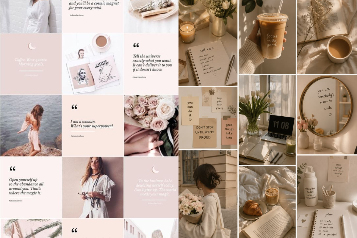
The first is a vertical, 2:3 aspect ratio. Pinterest's own guidance recommends this format because it occupies more vertical space in a scrolling feed and performs measurably better than square or landscape formats. Beyond Pinterest, this ratio has become a visual shorthand for content designed to be referenced rather than glanced at. It signals a considered layout rather than a repurposed square post.
The second is restraint in the color palette. High-performing saved content tends to use two or three dominant tones with one accent color, rather than a wide spread of competing hues. This is not a stylistic preference; it is a cognitive shortcut. A limited palette allows a viewer to sort visually similar content into mental categories quickly, which is exactly what happens when someone is building a board or a private reference collection. Brands with inconsistent color use across their assets make that sorting harder, and content that is harder to categorize is less likely to be saved.
The third is legible, with minimal typography layered over imagery. Pins and reference assets that use large, high-contrast type with short phrases outperform those with dense paragraphs of overlaid text, because the information needs to be absorbed in under a second while scrolling. This principle translates directly to how corporate content, such as an infographic, a LinkedIn carousel, or a case study cover, should be typeset. Overlaid text should function as a label, not a paragraph.
The fourth is negative space. Cluttered compositions read as promotional and are filtered out quickly by viewers who are pattern-matching for utility. Clean, breathing layouts with a clear focal point signal editorial intent rather than advertising intent, and editorial content is precisely what gets saved for later reference.
Finally, cohesion across a set of assets matters more than any single image. Pinterest's algorithm and its users both reward boards and profiles with a consistent visual signature, because that consistency is what makes a brand recognizable at a glance across dozens of saved items in someone's collection. A company's imagery should be identifiable even with the logo removed. That is the practical test of whether a visual identity has actually been built, rather than assembled on an ad hoc basis, campaign by campaign.
Utility Over Novelty: Building Evergreen Value
Novel content generates a spike and then decays quickly. A clever visual gag, a trending format, or a timely reference to current events can perform well for a short window, but it rarely gets saved because its relevance has an expiration date. Utility behaves differently. A well-designed how-to graphic, a comparison chart, a checklist, or a clearly structured reference guide holds its value for months or years, and each save extends its reach far beyond its original publish date.
This is measurable on Pinterest in a way that is instructive for any brand. Content on the platform frequently continues generating impressions and saves for six months or more after publication, a lifespan that has no equivalent on feed-based platforms, where a post's visibility window is typically measured in hours. The mechanism is simple: search-driven discovery means an old Pin can still surface against a new search query, provided the content itself remains genuinely useful.
For a business audience, the practical translation is to treat visual content as a small piece of durable infrastructure rather than a disposable promotional unit. A pricing comparison graphic, a step-by-step process diagram explaining how a service works, or a clearly labeled before-and-after of a completed project will keep earning attention long after a seasonal campaign graphic has been forgotten. The design brief for each asset should include a simple question: Will this still answer someone's question in a year? If the honest answer is no, the content belongs in a short-term campaign, not in the core visual library a brand wants people to keep returning to.
Utility-first design also changes how a company should think about its content calendar. Instead of treating every asset as a one-off tied to a launch date, evergreen-oriented brands build modular content templates, guides, and reference visuals that can be updated incrementally rather than replaced entirely. Pinterest's annual trend forecasting report, which the company reports has achieved roughly 80% predictive accuracy over its multi-year track record, is itself built on this principle: it analyzes billions of searches and saves to identify sustained shifts in taste rather than short-lived spikes, and brands that align their visual planning with those longer cycles consistently outperform those chasing weekly trends.
Case Studies: Brands That Built a Savable Identity
A handful of companies illustrate how these principles translate into practice.
Home and furnishing retailers such as IKEA and West Elm have built large parts of their content strategy around room-by-room styling boards rather than isolated product shots. Each image functions as a small planning tool: a full room composition that a saver can reference when they are ready to buy, rather than an image admired once and forgotten. This mirrors exactly how Pinterest users naturally organize their own boards, by room, project, or occasion, which makes the content easy to slot directly into an existing collection.
Beauty retailer Sephora has built a substantial presence around tutorial-style content: step-by-step application guides broken into clear, numbered visual stages. This format satisfies the utility test directly, since a tutorial remains just as useful on the day it is saved as it does three months later when the saver is finally ready to try the look.
Software companies have applied the same logic to less visually obvious categories. Canva and Notion both maintain libraries of template previews designed to be saved and revisited when a user starts a new project, effectively turning their product documentation into a searchable, saveable reference collection rather than a conventional feature announcement.
Travel and hospitality brands, including Airbnb, have used itinerary-style content, multi-stop guides broken into individual, saveable segments that map directly onto how travelers plan trips over weeks or months rather than deciding in a single session. Breaking a broader guide into individual saveable pieces increases the odds that at least one segment matches a specific search a planner runs later.
Across all four examples, the common thread is not aesthetic polish alone. Each brand designed content around a real, recurring decision-making process its audience goes through, and then built visual assets specifically shaped to be useful at the exact moment that process resumes.
The shift this article has traced is a change in what earns durable attention. Content built purely to interrupt a scroll has a short half-life. Content built to answer a real, recurring question earns a place in someone's private reference collection and keeps generating value long after publication.
Businesses that want to apply this shift can start with four concrete steps. First, audit existing visual assets against the save test: would a prospective client keep this image for later, or does its value expire the moment it is seen? Second, standardize the visual architecture across all outward-facing content — aspect ratios, palette, typography, and negative space — so that a portfolio of assets reads as one coherent identity rather than a series of disconnected campaigns. Third, prioritize utility-driven formats such as guides, comparisons, and process breakdowns in the content calendar, treating them as durable infrastructure rather than short-term promotion. Fourth, study the recurring decisions an audience makes and design content that meets them at that exact planning moment, the way the strongest Pinterest-native brands already do.
The businesses that master this discipline will not simply be seen. They will be kept, returned to, and eventually chosen — and in a business environment where decision cycles are long and competition for a shortlist spot is intense, that quiet, ongoing presence in a prospect's saved collection is often worth more than any single moment of visibility.
Also read: